Geometric abstractions and the contortion series
Studies of experimentation and composition dated from 2014

Studies of experimentation and composition dated from 2014
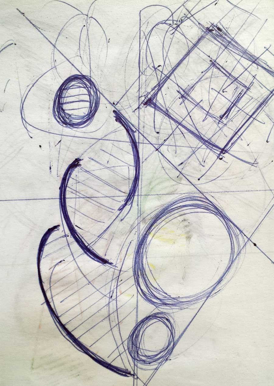
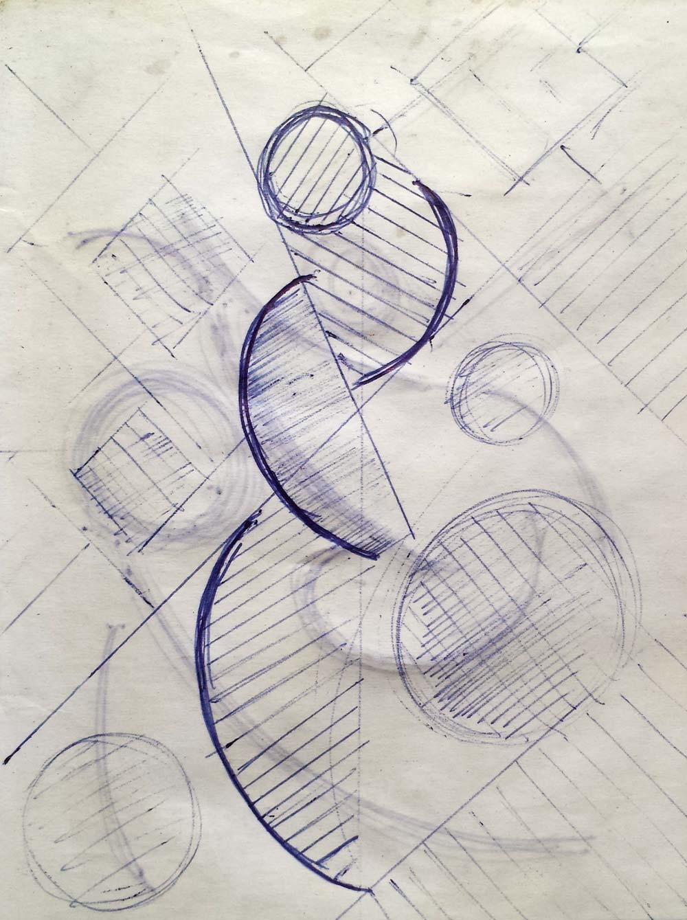
The geometric abstractions in my collection date from 2014 and are grouped in the drawings and paintings of the contortion series and in other studies of experimentation of form and composition. In this publication I wanted to show the creative process for each of the pieces that belong to this period. Taking as reference the compositions of classical works and applying essential elements of graphic language, I have obtained geometric abstractions and contortions of the figure with varied compositional dynamics.
For certain geometric abstractions and some of the works for the contortion series, I have taken some classical sculptures and paintings of Greek, Roman and Renaissance art as composition references (I have published those references in my pinterest account). The Venus series is part of this starting point, in which the lines and forms of reference to classical works describe the compositional scheme of abstract figures.
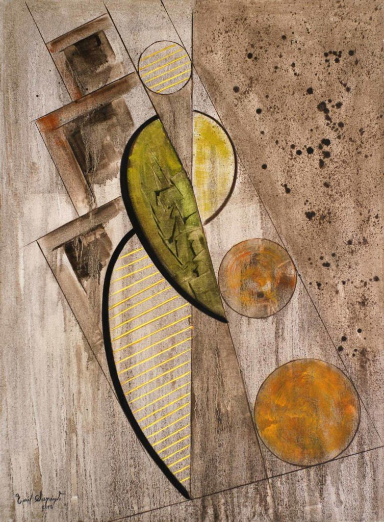
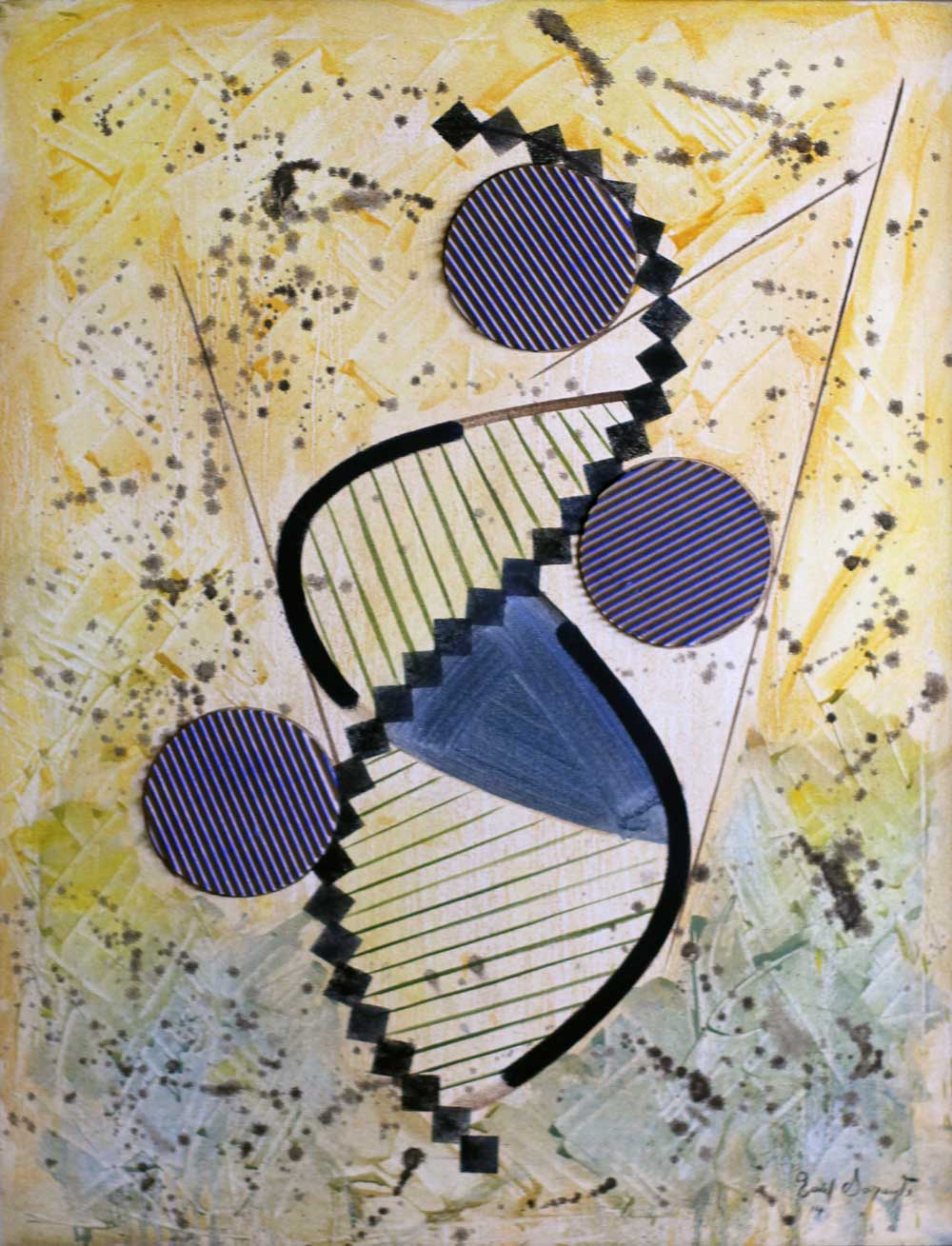
Venus no.2 belonging to the series of contortions, was initially conceived with general strokes of curved lines and circles. Then in subsequent processes the lines and planes that reinforce the compositional interest of the work were added. It is a work in which the ocher color of the background applied with the dripping technique and the olive green for the figure predominates. For the final work I used corrugated cardboard with its striated relief and applied a square-shaped stencil to frame the guiding axis of the composition.
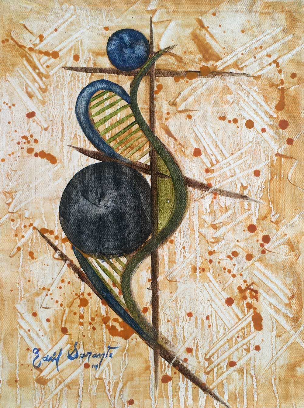
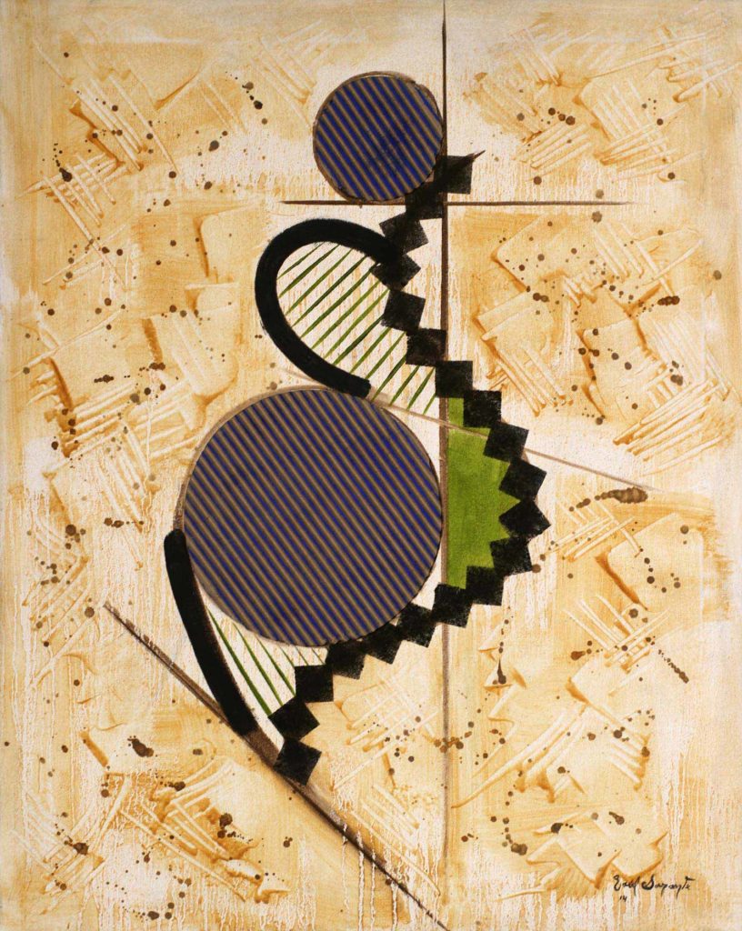
Venus no.3 follows the same guidelines as the previous venus, varying only its composition and somewhat more intense tones in the background. The dripping technique is in this occasion more lively with varied ocher and shadow earth tones. The curved lines predominate over the olive-green straight lines inside the figure and the stretch marks of the corrugated cardboard.
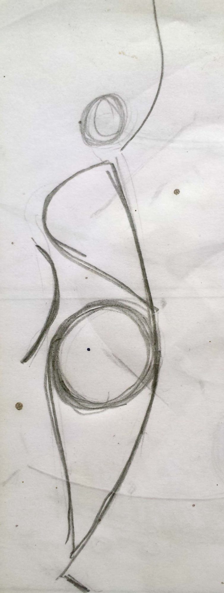
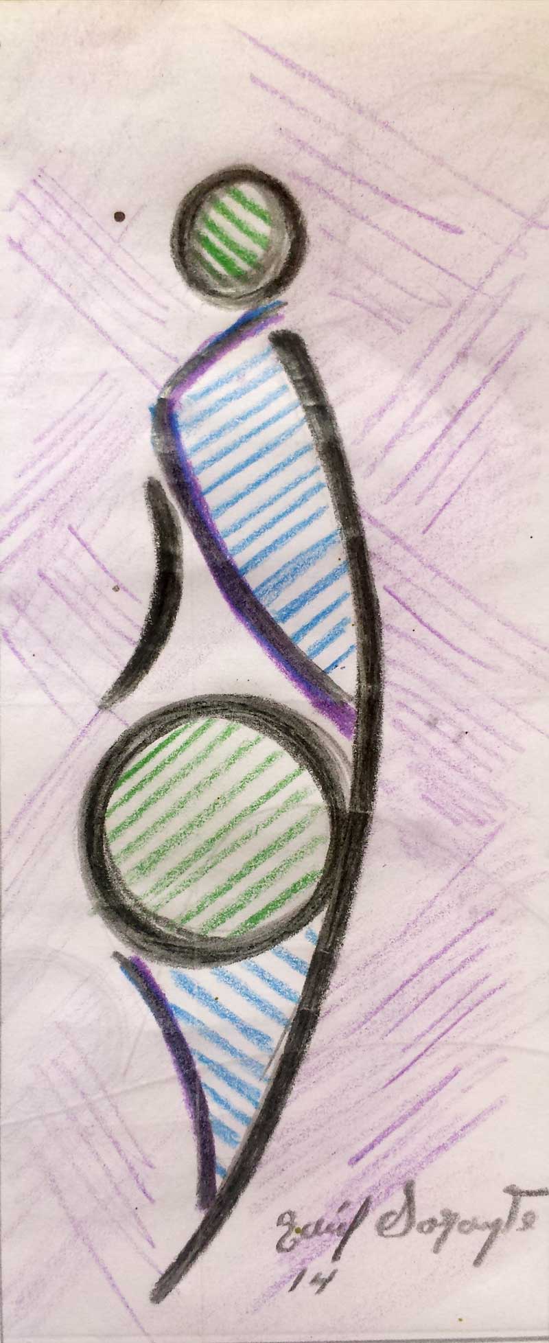
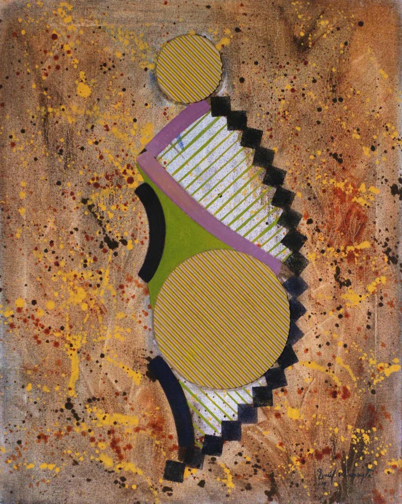
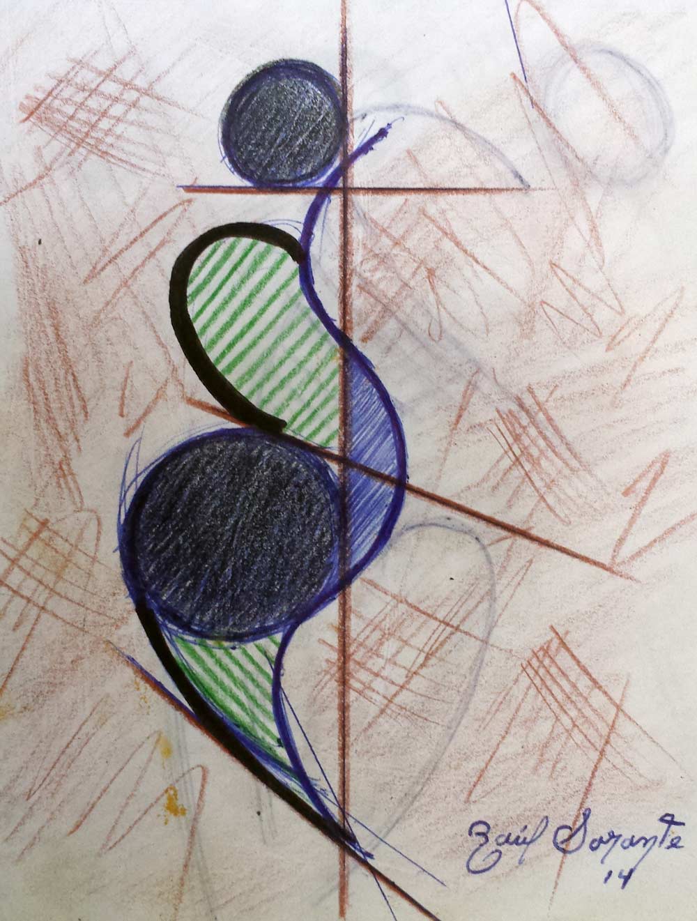
The dynamics that were generated with the curved forms, in many of the compositions that I made to be part of my artistic pieces, gave rise to grouping them with a generic title whose name was “Contortion”. This word means abrupt or forced movement of the body (understand the human body) or any of its parts. Due to the fact that these compositions arose from the previous study of the human figure in classical and neoclassical art, I found it appropriate to apply the term to this set of works where its main attraction lies precisely in the tension produced by the curved line in the composition .
The work “Twist around” is a clear example of the effect of tension that has the curved line and therefore of the feeling of imbalance that generates in the viewer. The composition is not very pretentious but the layout and use of the elements of graphic language give variety to the whole work.
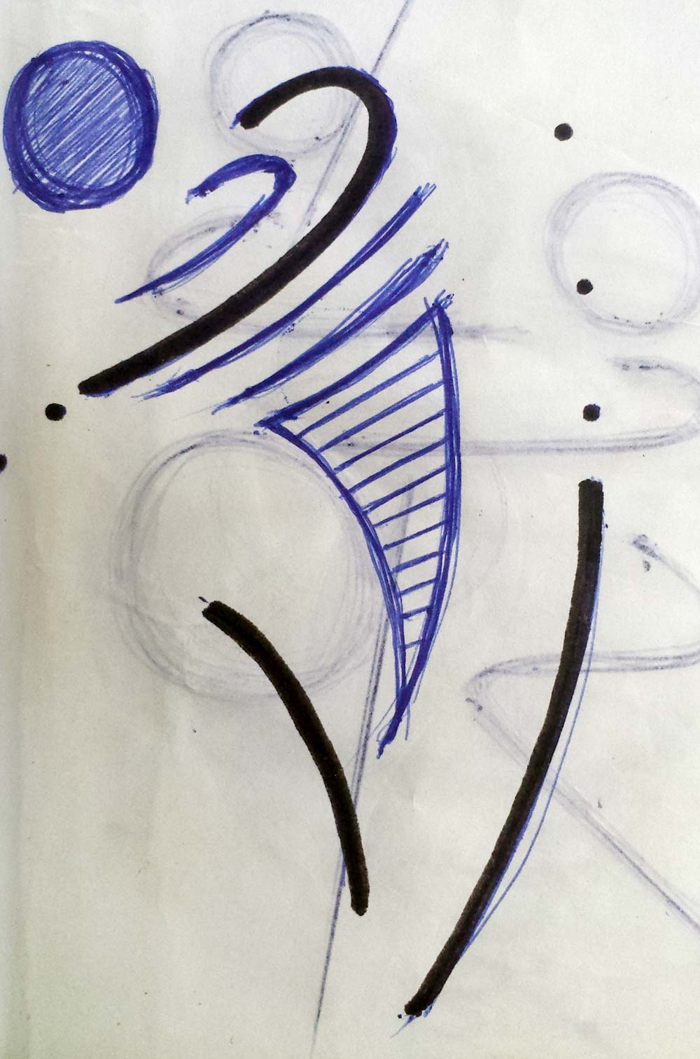

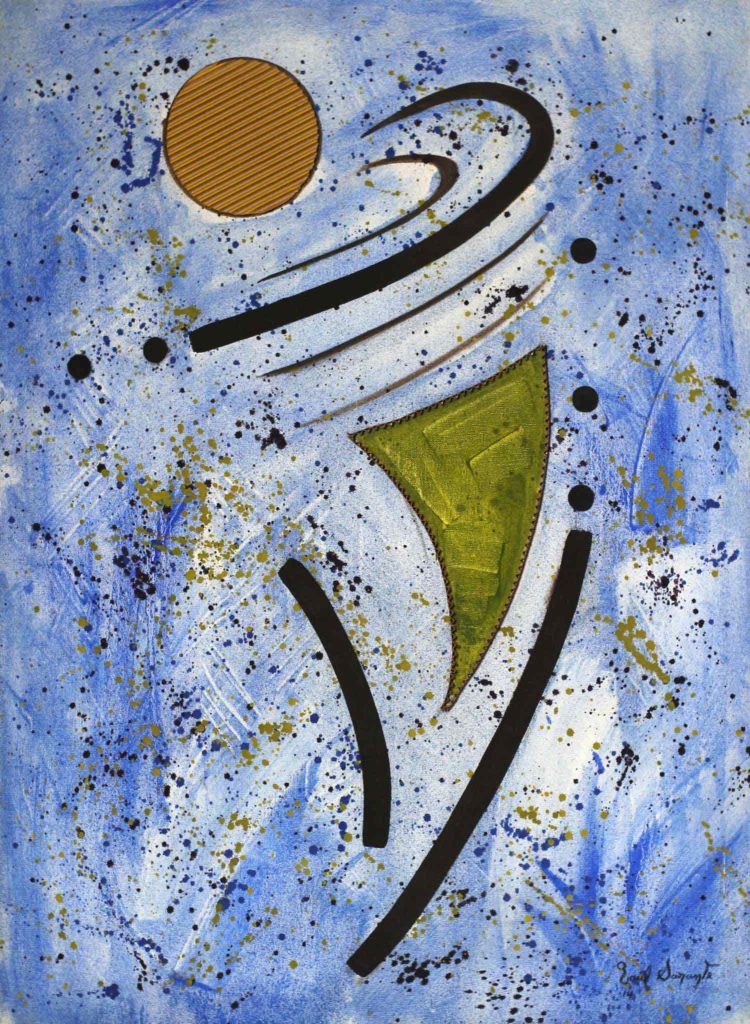
This work at first glance would seem to refer to the spin of a spinning top. It has a symmetrical composition of curved lines on either side of its transverse axial axis. Straight lines demarcate its axiality and add variety to the dominant verticality in the work. This is one of the most significant geometric abstractions and contortions of the series, due to the predominance of curved lines and the rotation it forms by rotating axially around an axis.
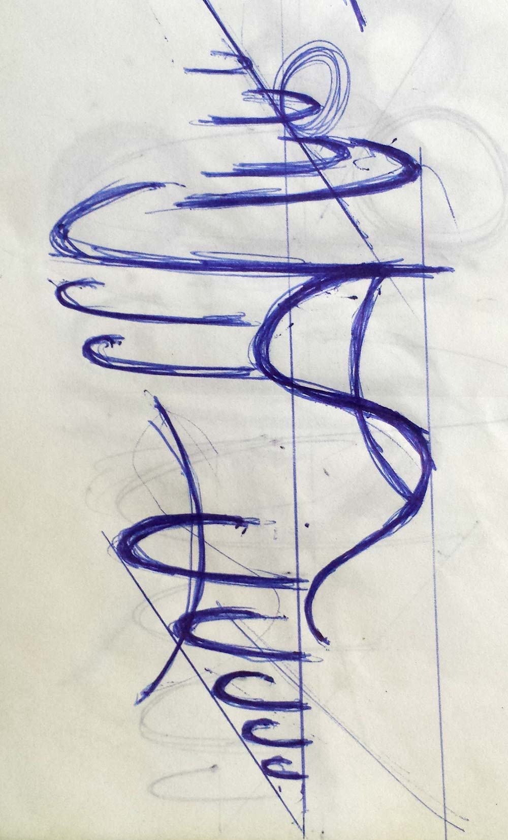
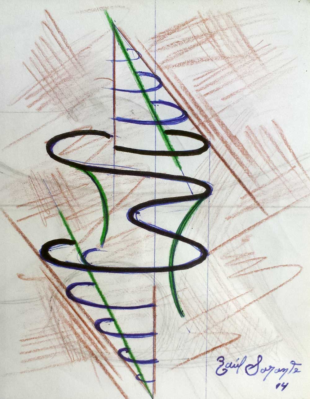
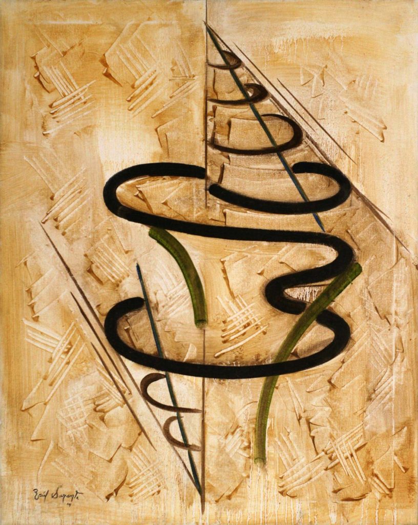
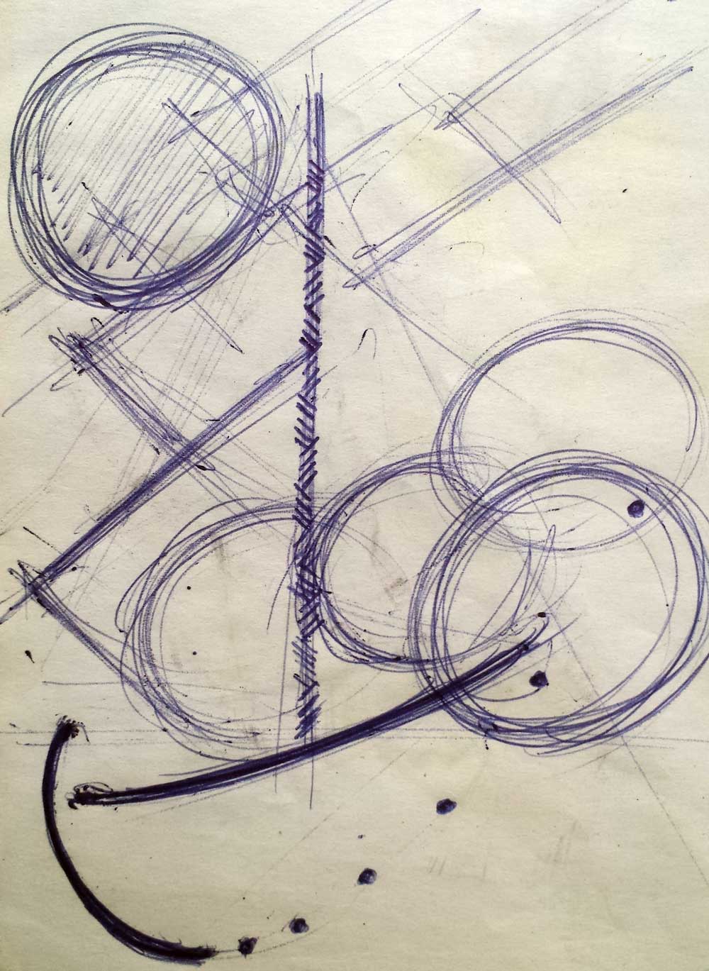
Among the geometric abstractions and contortions made in this period, this work takes the title of the series. The sketch began with circular elements interspersed by a central body, which rotates axially in two opposite directions, which reinforces the torsor effect. Subsequently, tangential lines were incorporated which, together with the central guideline, make up the composition of the assembly. As in previous works, I make use of parallel lines arranged rhythmically within the figure. The warm tone of the background maintains its egemony over the black that cuts the figure and the blue of the pieces in corrugated cardboard.
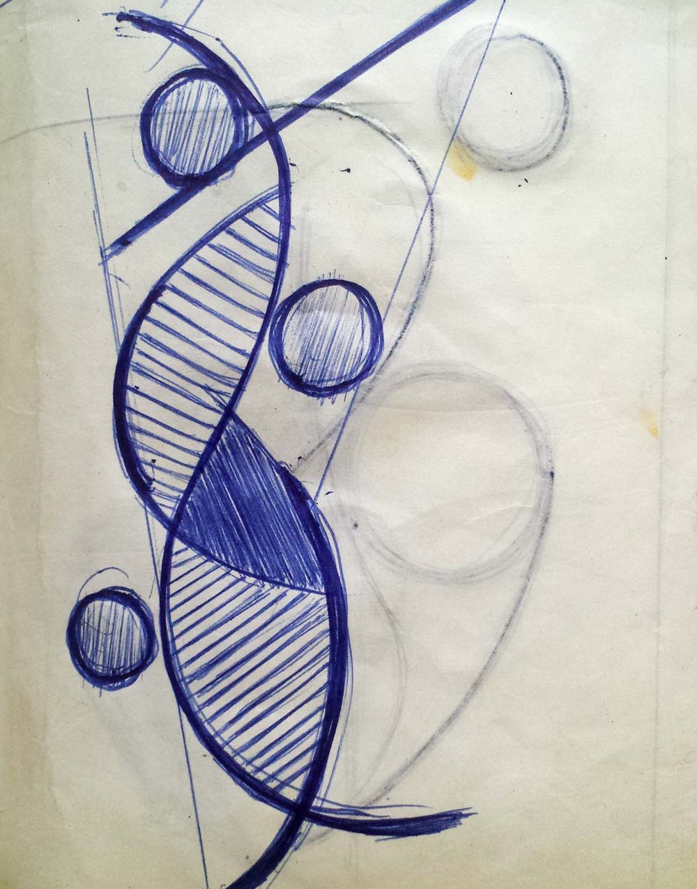
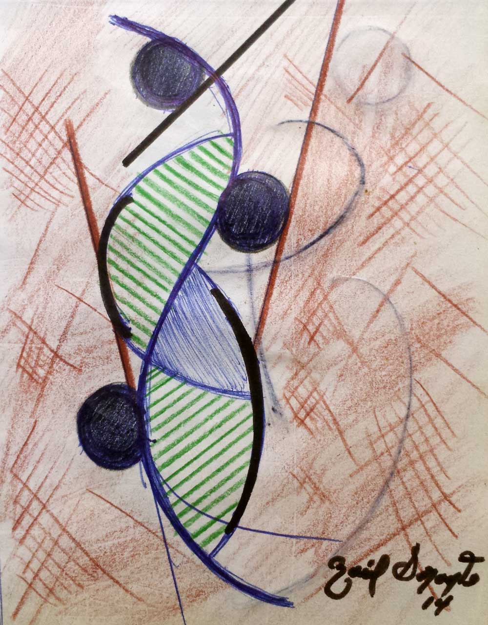
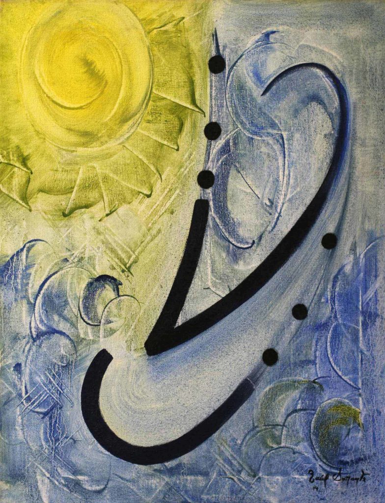
It is common to find in my abstractions the use of the point, the line and the forms of closed planes as graphic resources to compose the space. Often the point appears as continuity of the line and together with other lines it usually forms a plane. The way the space is structured with these elements, will tell a lot about the compositional quality of a work, no matter it could be figurative, abstract or a symbiosis of both.
This work includes elements of graphic language such as point and line. In previous sketches, the central plane was structured with rhythmic parallel lines to provide some visual texture to the composition. However, the final result was modified in favor of using a frottage technique, which was more in line with the texture of the entire work.

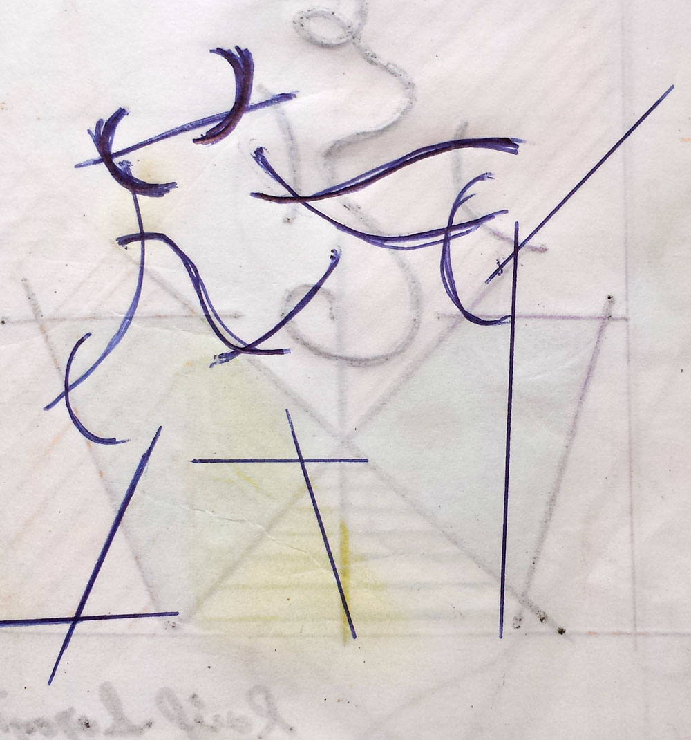
Straight lines are the dominant axis in this composition that includes two separate dancing figures. There is a clear geometric sense in this work where the rhythm of parallel lines and planes without tonal variation predominate.
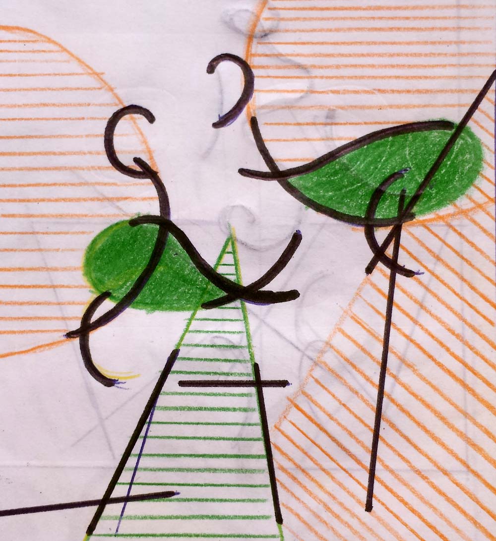
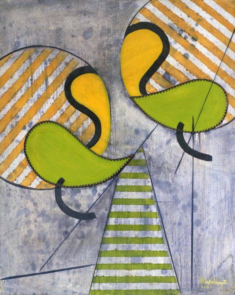
“Composed squares no.3” belongs to a series of three pieces where the primary form in the composition is intended to be the quadrilaterals. In the time I started working with these ideas, I used to start the sketches by forming squares and rectangles that later in the middle of the experimentation generated lines and planes that ended up making a composition.

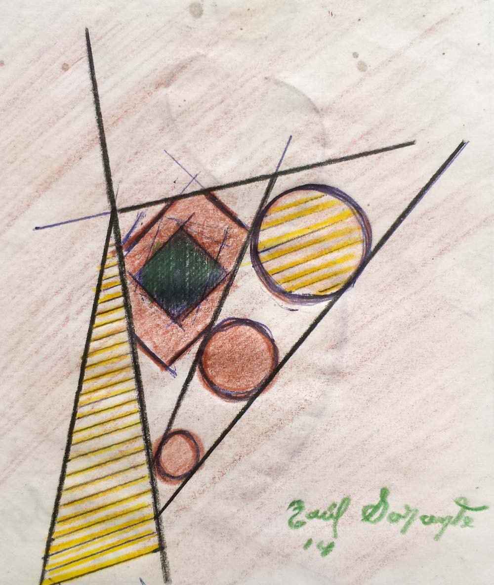
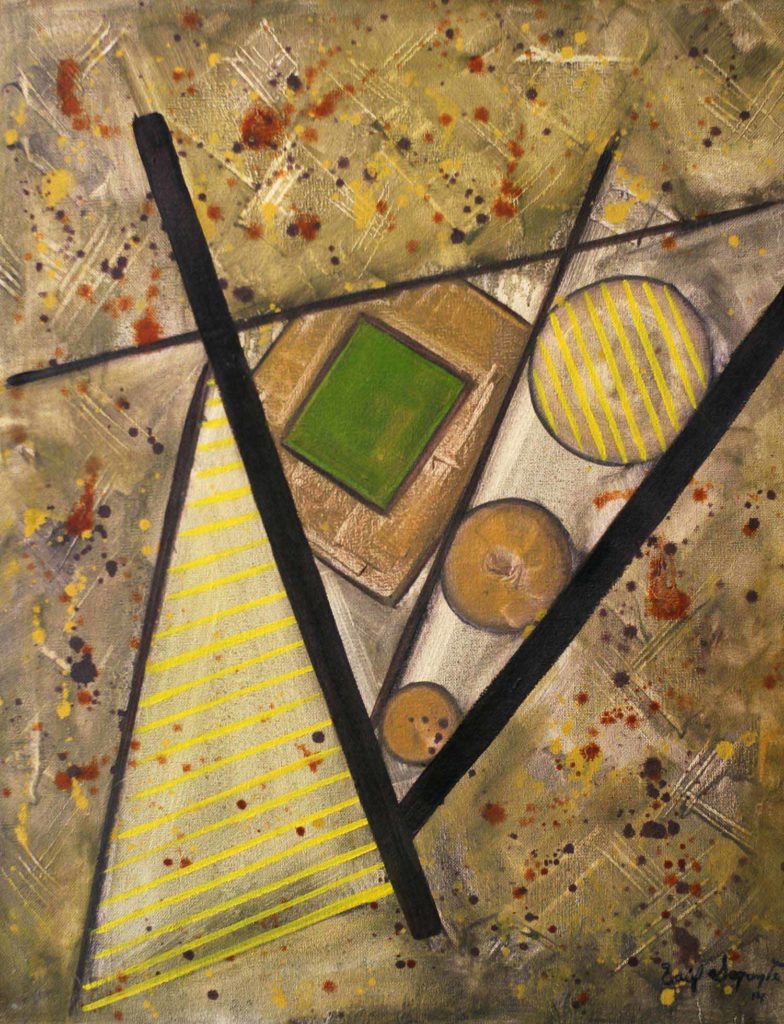
Venus no.1 belongs to the series of contortions where curved lines and circles that describe the figure predominate. Straight lines and quadrilaterals emphasize the composition and conformation of the guidelines of the work as a whole. I have chosen to make use of a warm range of colors with earthy, green and yellow tones to contrast with the different elements that make up the work. The dripping technique is very present in the painting, especially for the background area. This technique will look alike in other solvent-based finishing work with little paint load.

